Goal: To create a logo for a sketchy pawn shop.
The idea was to create a logo with pawn shop symbolism. I liked the idea of using an old-time lamp post that you might see in a back alley for the design.

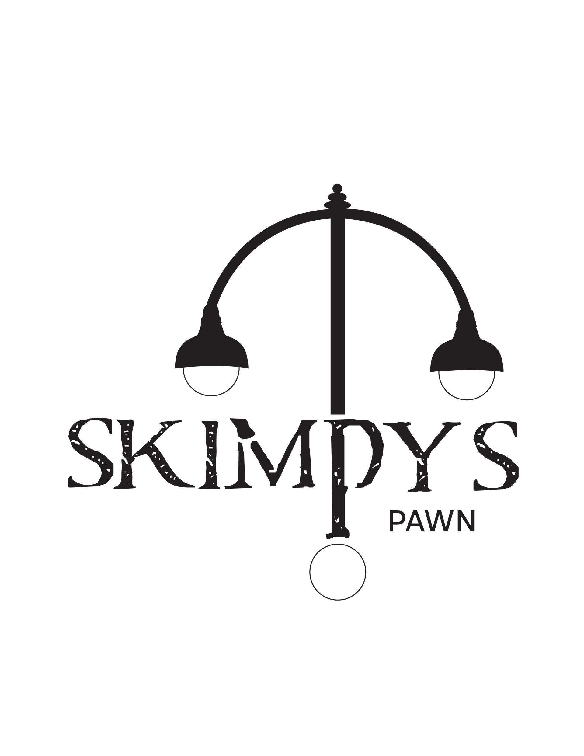
I found a distressed font called Carta Marina that fit the style I was going for. I extended the P to be a pard of the lamp. From here, the logo looked flat an off balance. I wanted to add some color and another element to bring it together.

The final logo is much simpler but has details that make it feel sketchy and foreboding. There is a dark feel to the lights because of the gradient used as well as the distressed feel of the font. The crow added another layer of darkness that makes it feel complete as well as balanced. Green is a prominent color in pawn logo design and the shade compliments the glow of the yellow lights.