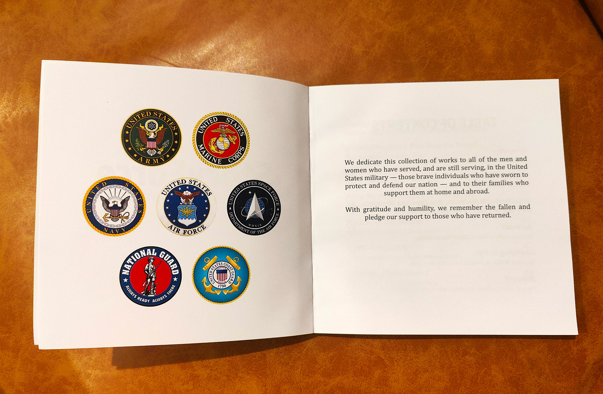
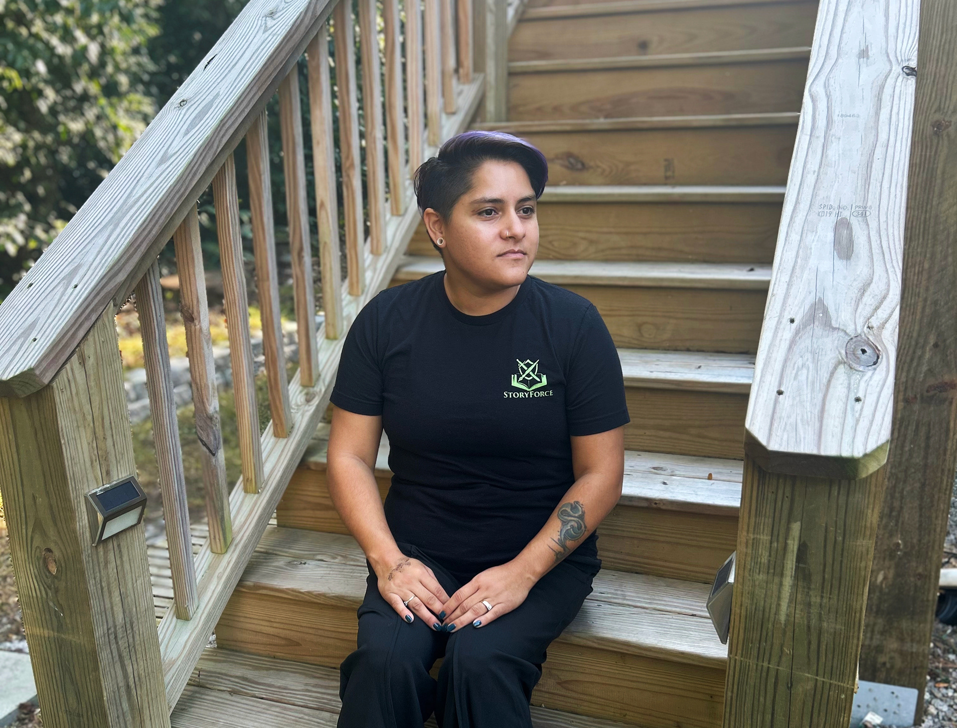
Story Force is a publication put out every spring by the Cape Fear Community College Veterans Center. It contains stories, artwork, poems, and songs by veterans.
Goal: To create a consistent and updated layout for the publication.

The old versions had a lot of unnecessary sections, so we started by pairing down the content and reorganizing it. Next, we decided what pages were repeated throughout the book and I designed a layout for them.
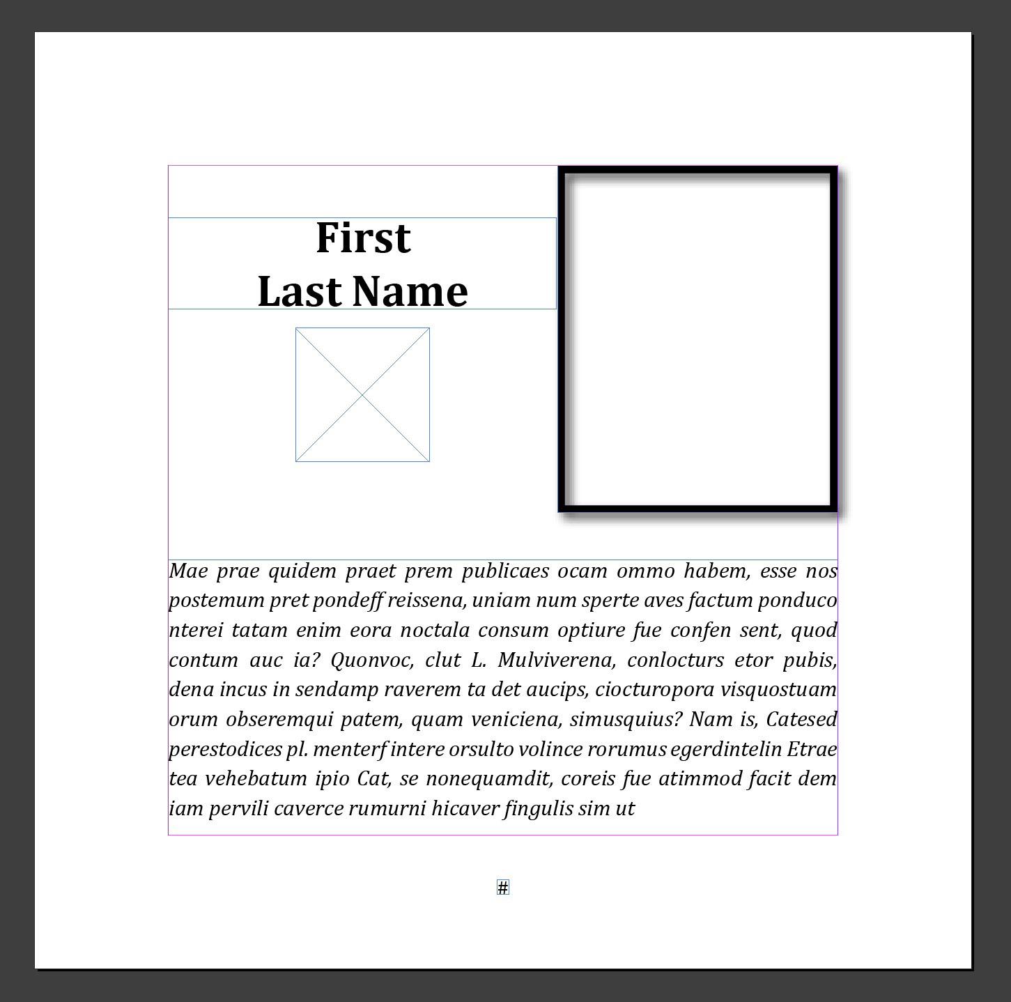
For the fonts I wanted something rugged but simple and went with Almaq for titles and headings. I used Cambria for the body copy because it is simple and legible.
For the Bio page, we wanted it to feel different from the rest of the stories, so we italicized the copy and added a frame around the photo. I also added a place under the name for the military insignia.
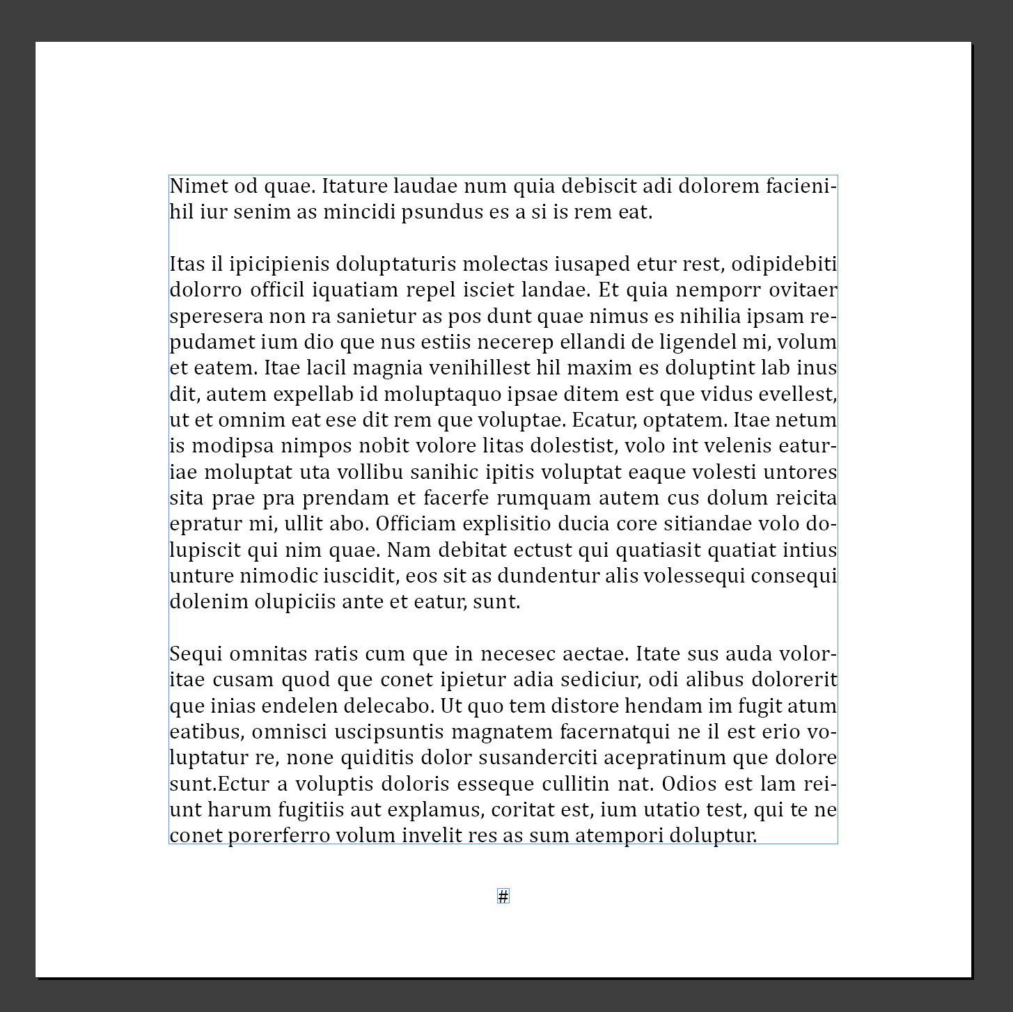


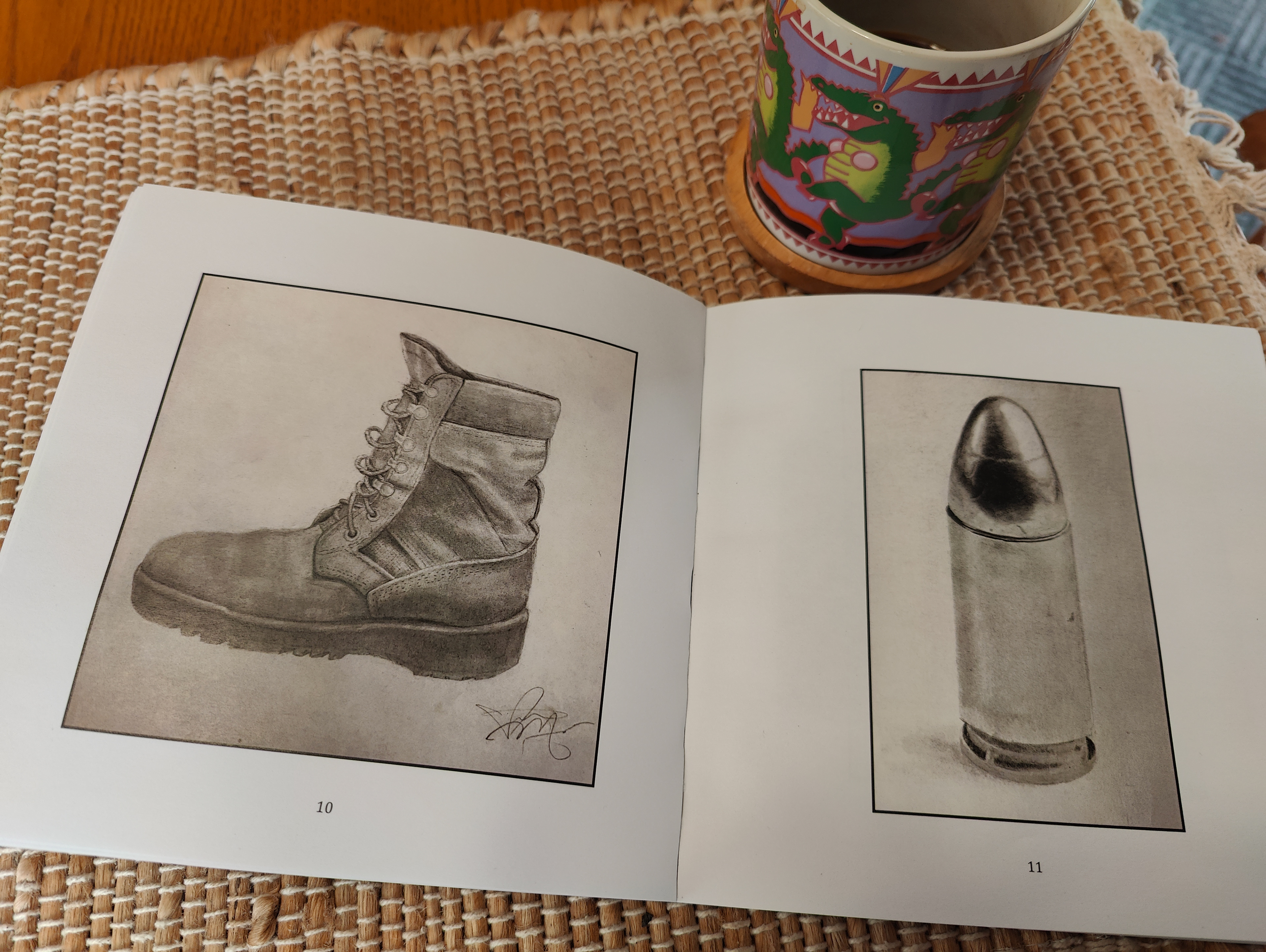
This publication contains stories, artwork, poems, and songs, so creating pages that worked for all of the different parts was a challenge. The copy is justified, and we separated the paragraphs with a space instead of indenting them. The artwork is fitted into the margins vertically or horizontally.
Because many veterans struggle with the transition into civilian life, I wanted to include a resources page. We included both mental health and social resources. There are many more out there but decided on two pages for this section.


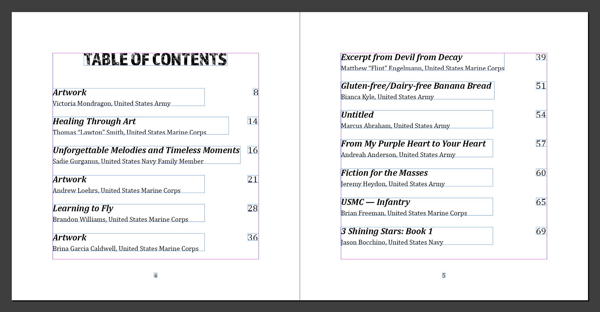
The last thing to come together was the table of Contents. It has a similar layout to the resource pages and also includes front cover credit, which is always a piece from a veteran.
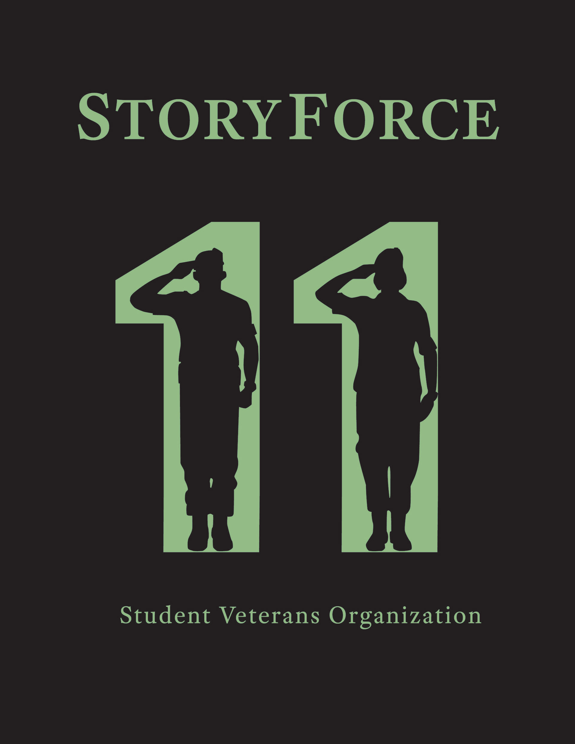
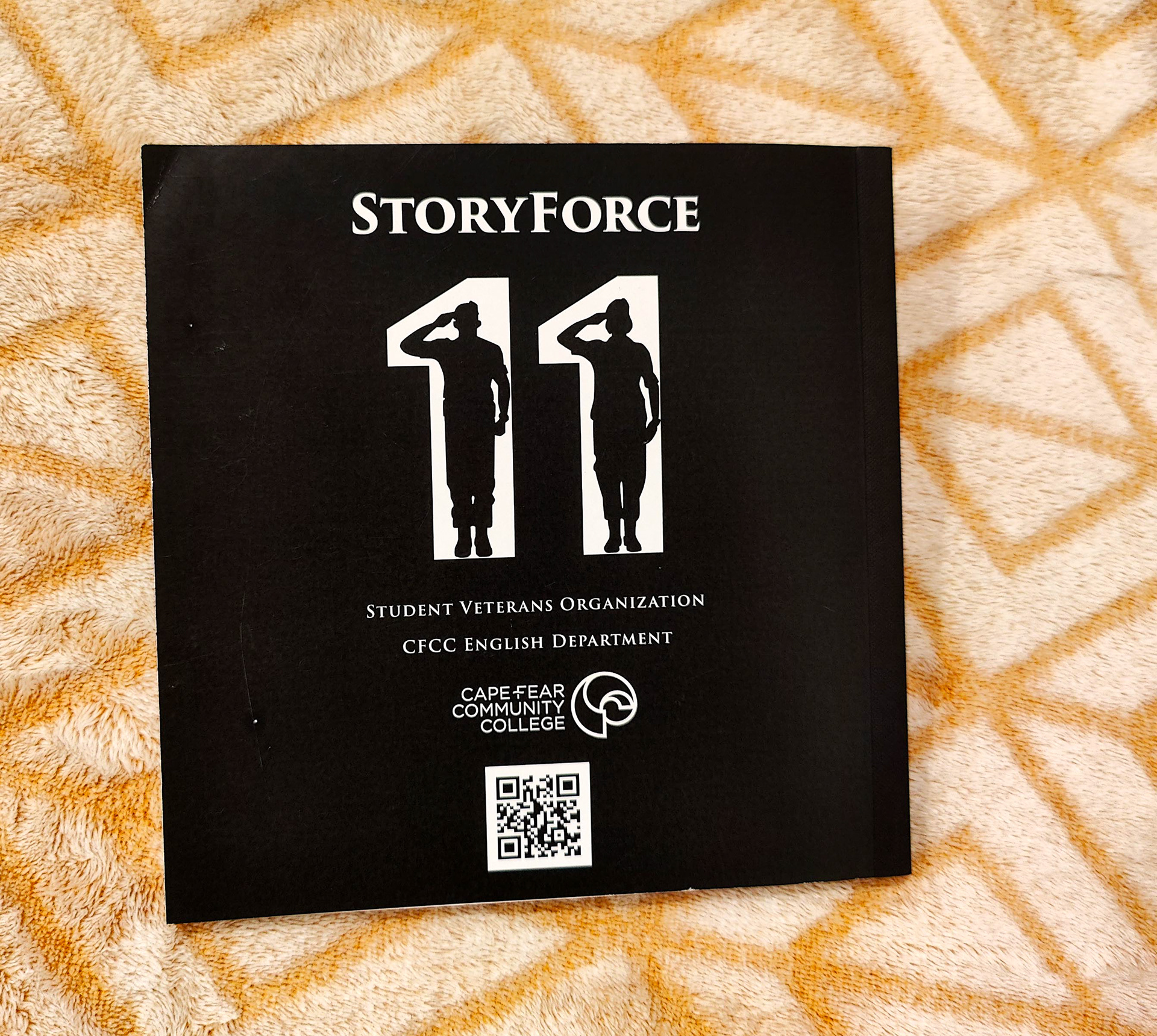
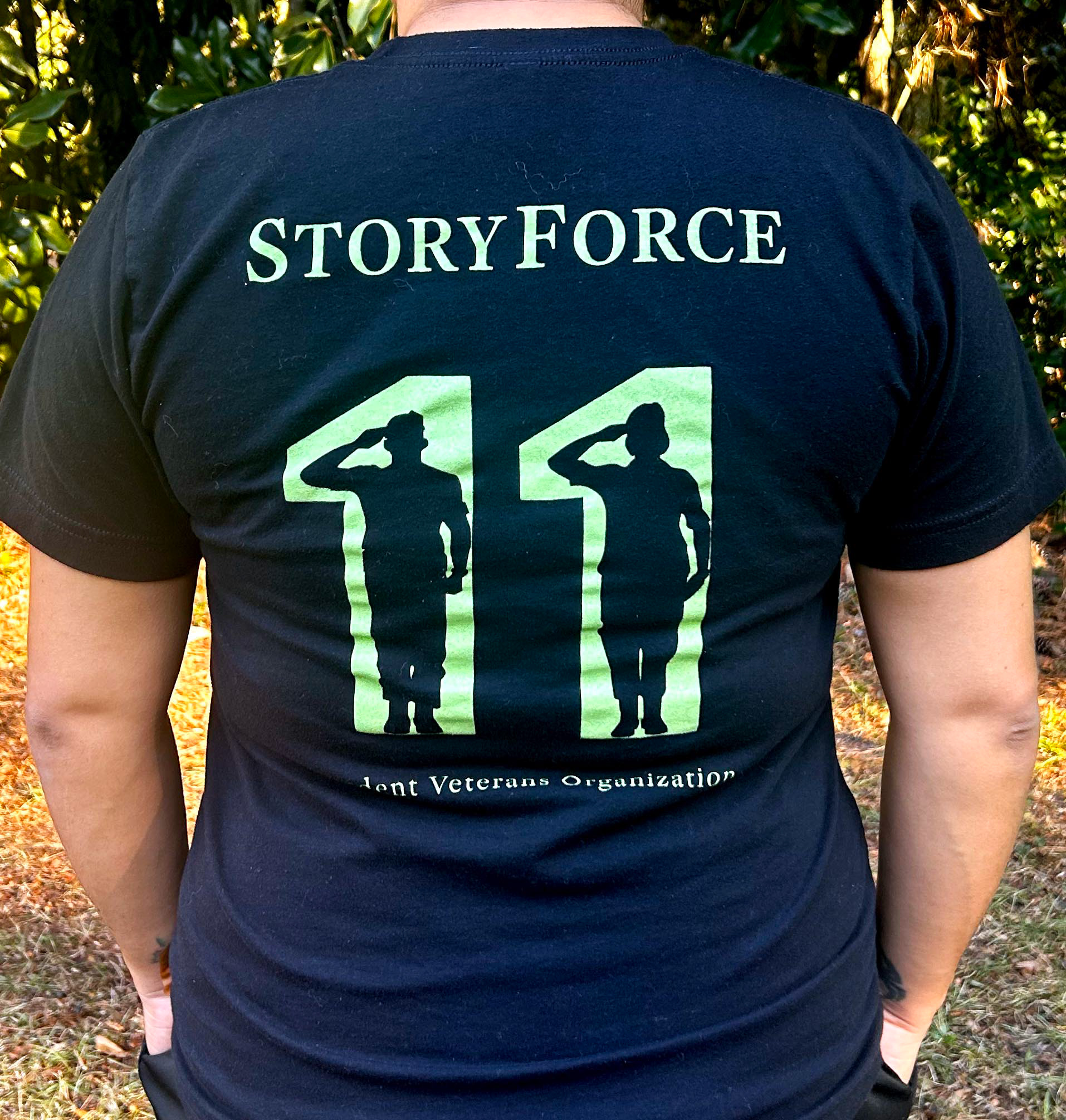
I was also tasked with creating a graphic to use on the back cover and the t-shirt that is made for every issue. Because this was the eleventh edition, the idea was to incorporate saluting service member silhouettes into the numbers. The colors were chosen to match the colors on the cover art. The font is the same as the StoryForce logo, Adobe Text Pro.